Over 8.4 million people in the region are dyslexic. However, none of the 650 Arabic fonts that are used globally, are dyslexic-friendly. Even though Arabic is one of the oldest and most beautiful languages in the world with 12 million distinct words it is also the most complex. Making it even harder for those with dyslexia to learn it.
Omantel, a brand that believes in inclusivity and better access to connectivity for everyone across Oman has designed the first Arabic dyslexia-friendly font in collaboration with Leo Burnett Dubai, an agency under Publicis Groupe Middle East. Drawing insights from dyslexic volunteers through the Institute of Learning Disability, the team crafted letterforms tailored to meet their needs. Because Arabic lettering relies on many similar shapes, the Leo Burnett team eliminated ligatures and introduced irregularities in noqat (dots) and tashkeel (glyphs), making each letter more distinguishable, mitigating reading, and writing errors.
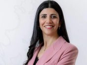
Commenting on the initiative May Al-Tobi, Ministry of Education, Oman said “We would like to thank Omantel for its continuous support in enhancing Oman’s educational system and making it inclusive for everyone”.
Omantel’s vision for the font is to apply it across digital platforms like websites and apps as well as printed collaterals including all its multiple customer touch points. It also wants to open source the font and release its design thinking for other brands and the Arabic Design Community to adopt, and bring more inclusivity into typeface designs for digital communication which is one of the most important forms of media today.
“We believe that this step will represent a big leap on the path of Education and learning in the Arabic language. It will effectively contribute to facilitating the reading process for students who face challenges in this context, commented, Qais Mohammed Suwaidan Al Aamir Omantel, CSR Specialist, Omantel.
Commenting on the font, Mohamed Dahab, Art Director, Leo Burnett Dubai, “I’ve been a typeface designer for over 10 years and have designed multiple fonts. Now, this is a special one because I combined my love for the craft of typography with a true human purpose that brings meaning to it.”
The long-term vision for the font is to be used in application of material like school education and textbooks to bring further inclusivity in new generation of students through learning and print material.


